This article originally appeared in The Bar Examiner print edition, Spring 2023 (Vol. 92, No. 1), pp. 55–60.By Drew Weiner, MS What do bar exam stakeholders have in common with economists, epidemiologists, insurance providers, and other similar professions? The work of each of these professions is informed by large, unwieldy datasets. A professor with fewer than 10 students might be able to gauge performance by studying a complete list of student grades, but this is not an option for bar administrators, such as those in New York who reported 9,610 Multistate Bar Examination (MBE) scores after its July 2022 exam administration. This common problem has a common solution: condense large datasets into summary statistics, which, for bar exam scores, facilitate comparisons between exam administrations, jurisdictions, and any other examinee characteristics of interest. But this increase in interpretability comes at a cost in precision. Condensing a list of thousands of exam scores into a single statistic strips away most of the detail used to compute it, and unusual underlying data can lead to misleading statistics.
This sometimes causes concern among bar exam stakeholders, such as in jurisdictions or exam administrations where changes in the MBE mean do not yield commensurate changes in the overall pass rate. In some cases, the MBE mean decreases, but the bar passage rate increases; in others, the MBE mean increases, but the bar passage rate decreases. A previous Bar Examiner article1 identified several potential explanations for these apparent inconsistencies, including the shape of the MBE score distribution. In this article we delve into this concept, first defining some of the terms used to describe the location and shape of score distributions, then exploring how distributions with unusual shapes can yield misleading means. These misleading means may in turn lead to inaccurate pass rate predictions.
Describing Distributions: Location and Shape
When describing a distribution, the overall location of its individual values (e.g., as plotted on a graph) is one of its most important features. For example, to understand if bar exam performance has improved, declined, or remained constant between two exam administrations, stakeholders frequently invoke the distribution’s location by asking questions about “average” performance. Although the average most commonly refers to the mean, defined as the sum of all values divided by the total number of values,2 the average is commonly represented by two other location statistics in addition to or instead of the mean. One of these is the median, defined as the middle-ranked value. It can be determined by listing the individual values in the order of their value, then identifying the middlemost value. The other is the mode, defined as the most frequently occurring value.
The extent to which these three location statistics represent the average depends on the shape of the distribution. Many variables are normally distributed, such that many of the values are equal to or near the mean, and as distance from the mean increases, the number of values decreases (see Figure 1). A normal distribution is also symmetric: the number of values decreases as distance from the mean increases. When a dataset is normally distributed, its mean, median, and mode are equal, and the mean will typically be used to describe the average.
Figure 1. Normally distributed dataset
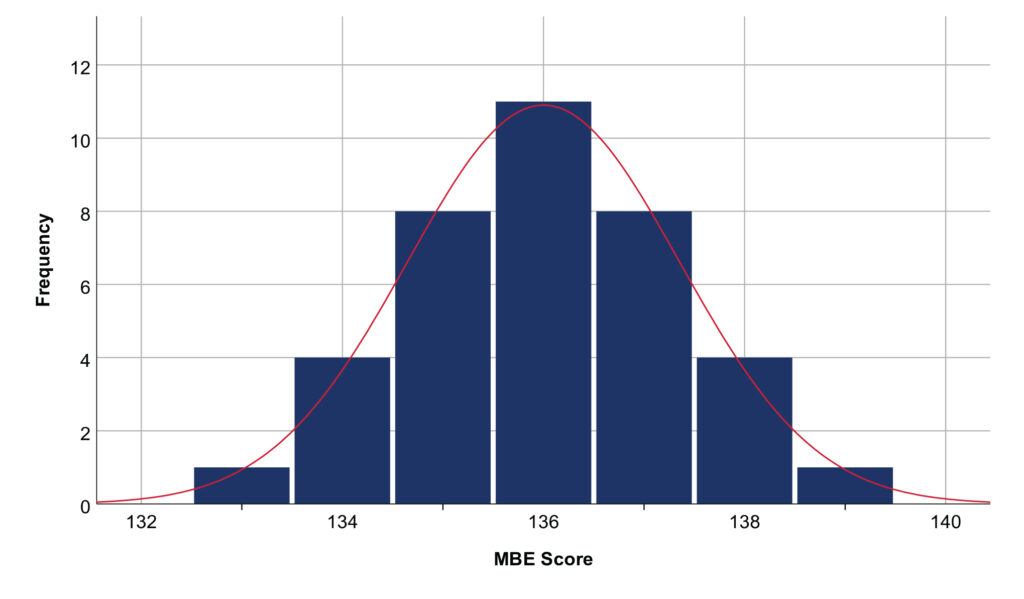 Note: The mean, median, and mode are equal to 136. These simulated data are completely symmetric and conform closely to a normal curve. Real data do not need to be completely symmetric or conform so perfectly to a normal curve to be regarded as normally distributed (e.g., see Figure 3).
When a dataset is not normally distributed, its mean can be a misleading representation of the average. Consider Figure 2: it contains a similar group of normally distributed scores as in Figure 1, but seven unusually high-performing examinees have been added so that the dataset is positively skewed (defined as having more extremely high values than extremely low values) instead of normally distributed. Because of these high performers, the mean has increased drastically from 136 to 144. Does the mean still represent an average examinee? No: the mean of 144 is located in the wide gap between actual scores—no examinee had a score equal to or even very close to 144, and 78% of examinees scored below this mean.
Figure 2. Positively skewed dataset
 Note: The mean (144) is greater than the median (136.5), which is greater than the mode (136).
If the mean has failed to reflect the average score, can the median or mode do better? The median in this example is the middle-ranked score (136.5), and the mode is the most frequently observed score (136); these could be considered the dataset’s “average” or “typical” examinees, and both the median and mode are actual scores observed in the data. But both statistics still fail to tell the whole story of the dataset—those seven extraordinary performers are likely of interest to exam stakeholders, and they have had nearly no effect on the median and no effect on the mode.
Recall that statistics are imperfect summaries of more complex datasets. When the underlying dataset is normally distributed, as in Figure 1, these three location statistics are at least nearly equal. But when the dataset has a non-normal shape, as in Figure 2, knowing how the statistics are computed is the only way to understand why they are different. And ultimately, one of the best ways to understand a non-normal distribution is to set aside these statistics, which do not tell the full story anyway, and instead plot out the entire dataset visually. That is, if you were told a dataset had 32 scores, a mean of 144, a median of 136.5, and a mode of 136, would you be able to recreate Figure 2? Probably not. This is enough information to make a reasonable guess, but you would need to be very lucky to recreate the dataset with perfect accuracy—many drastically different datasets could meet these criteria. In other words, summary statistics provide a useful snapshot, but they do not tell us everything.
Is Non-normality a Concern for Bar Exam Data?
We have argued that non-normally distributed datasets can yield misleading means, but to what extent are bar exam data non-normally distributed? Fortunately, in most jurisdictions and in most exam administrations, bar exam scores are approximately normally distributed. But this is a tendency—not a guaranteed rule—and to the extent that a set of exam scores are non-normally distributed, treating the mean exam score as the average and comparing means across exam administrations or jurisdictions can be misleading.
MBE scores from February 1993 to July 2022 are plotted in Figure 3. Visually, the distribution seems normal: most scores are distributed symmetrically around the mean, and as distance from the mean increases, the number of scores decreases. To test this assumption more rigorously, we can compute a statistic representing the distribution’s skewness. Skewness is the extent to which values are asymmetrically distributed: a negative skewness statistic indicates there are more extremely low values than extremely high values, and a positive skewness statistic indicates the opposite. A skewness statistic with a larger absolute value indicates the distribution is more severely skewed, and a skewness statistic of 0 indicates the distribution is perfectly symmetric. According to conventions for interpreting skewness,3 the MBE scores from February 1993 to July 2022 are approximately symmetrically distributed (skewness = −.244).
Figure 3. MBE scores from February 1993 to July 2022
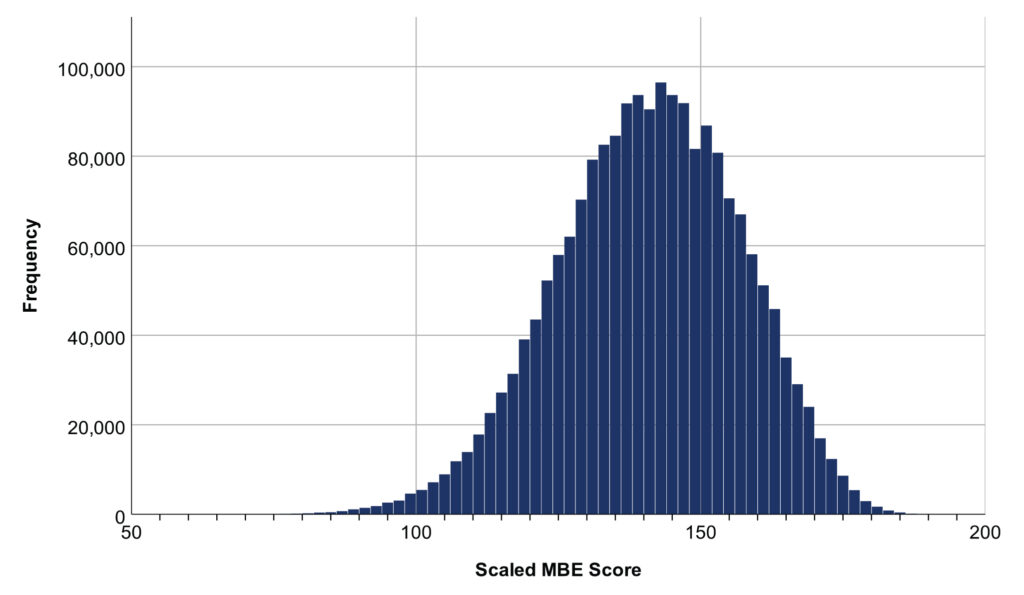 Note: Mean = 140.6, median = 141.1, mode = 136.0, and total number of scores = 1,972,263.
This large dataset of MBE scores from all jurisdictions over a period of three decades is approximately normally distributed, but in most cases stakeholders need to make more specific comparisons, such as between two exam administrations from a single jurisdiction. Are scores still symmetrically distributed for these narrower units of analysis? Often, but not always: if we divide scores from February 1993 to July 2022 into separate datasets for each jurisdiction and each administration, 14 datasets are highly negatively skewed, 136 are moderately negatively skewed, 2,762 are approximately symmetrically distributed, 78 are moderately positively skewed, and 22 are highly positively skewed. Thus, 92% of these datasets are symmetric enough that the mean should be a reasonable representation of the average. But how should we handle the remaining 8%?
From Means to Pass Rates
For the mean to be a dependable indicator of the pass rate, the underlying distribution must be at least approximately normal. For example, imagine a jurisdiction in the July 2021 MBE administration had 10 examinees, with a mean score of 136. Based on a passing score of 136, 70% of these examinees passed. This hypothetical dataset is plotted in the top panel of Figure 4. Note that the dataset is approximately normally distributed. In 2022, a different group of 10 examinees obtained a higher mean score of 140. If the passing score was still set at 136, did more, fewer, or the same number of examinees pass?
Figure 4. Hypothetical datasets for a July 2021 MBE administration: possible distributions in 2022 given a mean increase of 4 points from 2021 to 2022
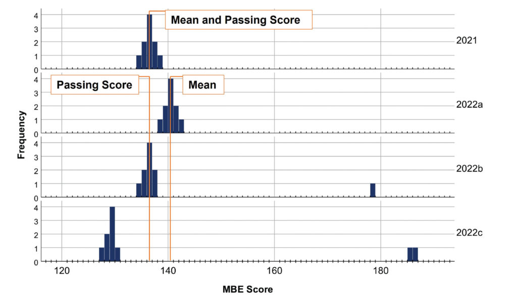 Note: Passing score is 136. 2021 is a normal distribution with a mean of 136 and pass rate of 70%. 2022a is a normal distribution with a mean of 140 and pass rate of 100%. 2022b is a positively skewed distribution (note the single high-performing examinee) with a mean of 140 and pass rate of 70%. 2022c is a positively skewed distribution (note the two high-performing examinees) with a mean of 140 and pass rate of 10%.
This is a trick question. Not enough information has been provided, so any of those three options could be correct. Most intuitively, the pass rate would increase if the shape of the underlying distribution did not change, but the location of the distribution did. That is, if the mean change was driven by each of the 10 examinees scoring 4 points higher, the pass rate would increase (see Figure 4, 2022a). However, if the mean change was driven by a small number of extraordinarily high performers, the shape of the underlying distribution would be different, and the pass rate could remain stable (as in Figure 4, 2022b), or even decline (as in Figure 4, 2022c).4 Thus, comparing means is a feasible method to predict changes in pass rate only when the underlying distribution’s shape 1) is approximately normal and 2) does not change substantially between the groups being compared.
In practice, the datasets we wish to compare (e.g., July 2021 vs. July 2022 exam scores) are usually somewhere between the extreme examples just provided. Two real datasets rarely have identical shapes, but it is also rare to observe a normal distribution in one administration and an extremely skewed distribution in the following administration.5 To the extent that the distributions being compared have dissimilar shapes, their mean difference can be misleading. And because the distributions being compared in practice are almost always somewhat differently shaped, the mean will almost always be an imperfect and incomplete summary of changes (including pass rate changes) over time.
Conclusion
What is the practical advice to take away? First, do not overinterpret the mean. Understand that if the underlying data are not normally distributed, the mean can be a misleading way to describe the average, and comparing the means of non-normal distributions is not advised. Remember that although statistics such as the median (the middle-ranked score) are conventionally used to understand average performance in non-normal datasets, this is not a perfect solution; statistics are abstracted summaries of datasets, and in isolation, they cannot tell us everything about the data. Finally, to compare performance over time or between groups, before computing multiple location statistics and formally testing assumptions of normality, consider plotting the frequencies of scores and comparing them visually—this may give more insight into how and why pass rates and means are changing.
Notes
- Joanne E. Kane, PhD, “The Testing Column: The MBE Mean and Bar Passage Predictions,” 91(3) The Bar Examiner 16–18 (Fall 2022). (Go back)
- Mark A. Albanese, PhD, “The Testing Column: What Does the Mean Mean and How Standard Is That Deviation?,” 83(3) The Bar Examiner 37–45 (September 2014). (Go back)
- Conventionally, distributions with skewness > |1| are described as highly skewed, those with skewness > |0.5| to |1| are described as moderately skewed, and those with estimates < |0.5| are described as approximately symmetric. For interpretation norms, see M. G. Bulmer, Principles of Statistics (Dover 1979); for the computational definition of skewness, see D. N. Joanes and C. A. Gill, “Comparing Measures of Sample Skewness and Kurtosis,” 47(1) The Statistician 183–189 (1998). (Go back)
- See also Susan M. Case, PhD, “The Testing Column,” 72(2) The Bar Examiner 43–45 (May 2003). (Go back)
- Furthermore, the exams produced by NCBE all have strict upper and lower score limits (i.e., no one can score below a 0 or above a perfect score), so even unusually skewed exam administrations are limited in their extremeness. (Go back)
 Drew Weiner, MS, is a Research/Psychometric Analyst for the National Conference of Bar Examiners.
Contact us to request a pdf file of the original article as it appeared in the print edition.