This article originally appeared in The Bar Examiner print edition, September 2014 (Vol. 83, No. 3), pp. 37–45.
By Mark A. Albanese, PhDIn the Testing Column, we cite statistics with such regularity that it is important to step back occasionally and try to make two commonly used statistics—the mean and the standard deviation (SD)—more understandable for readers. In this article, I hope to help make these two statistics, and particularly the SD, have more meaning. While this material can perhaps be challenging to digest for the nonmeasurement person, understanding these concepts is essential to employing best practices in scoring.
Methods Used to Estimate the Average of a Set of Scores
To help with this effort, I am going to invoke an analogy of buying a house. As the adage goes, when buying a house, the three most important things are location, location, location. In statistical terms, the equivalent of location is the center, also termed the average, of a set of scores. Statisticians believe that we live in a probabilistic world. In a probabilistic world, nothing ever occurs with absolute certainty, but with a certain probability. Since nothing is known with absolute certainty, we usually say we are estimating things.
The Mean (for a Symmetric Set of Scores)
In the case of the location of a set of scores, the most commonly used estimate of the average score is the mean, the sum of the scores divided by the number of scores. People often think that the mean and the average are the same thing, but they are not. The mean is just one of many ways that can be used to estimate the average, or the location of the center of scores on a scale.
The mean works very well in estimating the average score as long as the set of scores is symmetric, meaning that the right and left sides of the score distribution look identical except reversed. This is much like folding a sheet of paper in half and then cutting a shape along the folded side; when you open up the cutout along the fold you will have left- and right-hand versions of the shape you cut, joined along the fold. The unfolded shape has perfect symmetry about the fold line. Similarly, if a set of scores has symmetry about the center and scores are generally concentrated in the center, then the mean will be the best estimate of the average score. Stated another way, a distribution lacks symmetry (i.e., is asymmetric) if there is an imbalance of extremely high or low values.
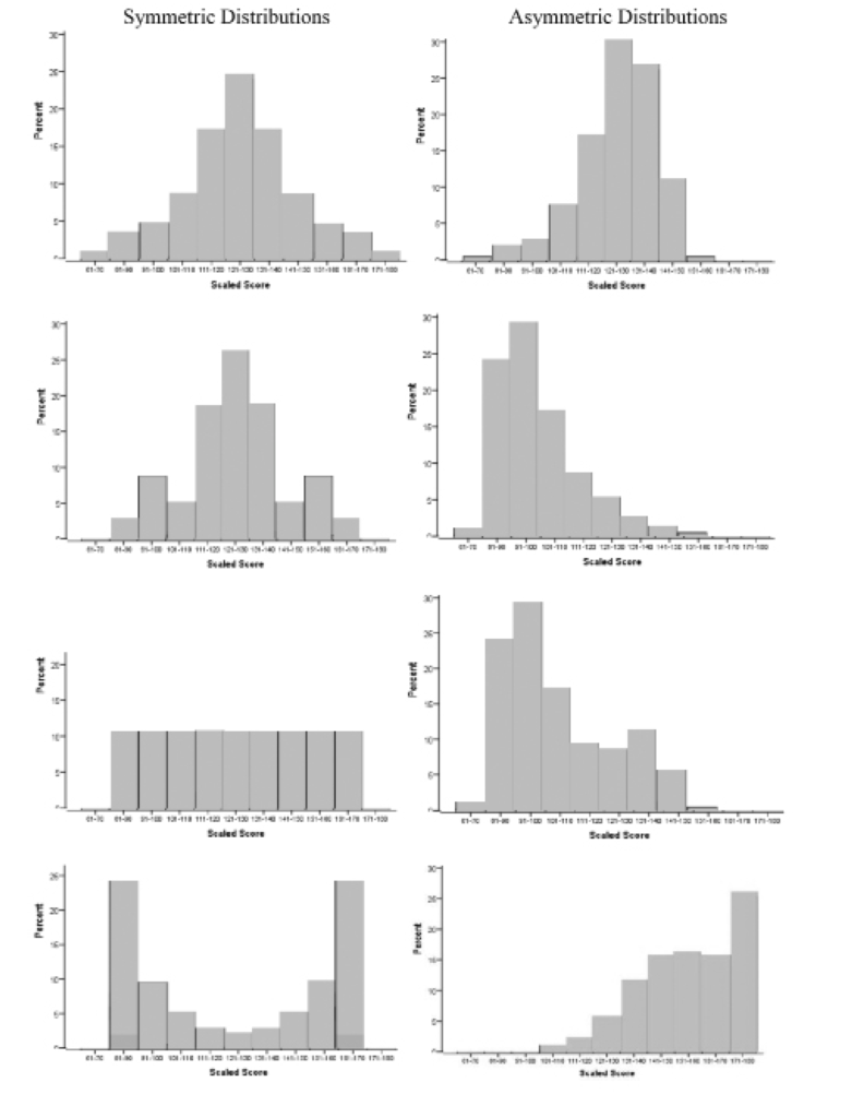
To illustrate what symmetric and asymmetric score distributions look like, Figure 1 shows a series of bar graphs of symmetric (graphs on the left) and asymmetric (graphs on the right) distributions based on MBE scaled scores.1 The graph on the uppermost left is the familiar bell curve, named for its bell-like shape. The largest percentage of scores is concentrated in the center, and the percentages fall off rapidly as you move away from the center in either direction. Note that the right side of the distribution looks like the left side of the distribution, but in reverse. This is a defining feature of symmetry and is present in all four graphs on the left.
The graphs on the right, however, do not have the mirror images on the right and left of the center. If you were to make a fold down the center of these graphs, there would be substantial areas where one side did not match the other side. They also generally have “tails” that trail out on one side or the other. Distributions that are asymmetric are usually termed to be skewed to one side or the other. If the long tail is on the left, as in the top and bottom graphs, the distribution is considered to be skewed left. If the long tail is on the right, as in the middle two graphs, it is considered to be skewed right.
The Median (for an Asymmetric Set of Scores)
While the mean is probably the most commonly used estimate of the average of a set of scores, there are many others. For example, when scores are asymmetric and severely skewed, having extremely high (or low) values shared by few individuals with no counterbalancing values on the other side of the distribution, the median, the point below which 50% of the scores fall, is often the preferred estimate of the average score.
To further continue with the housing analogy, prices of homes in an area are typically described using the median price. This is because on the high side, the price of a house is almost limitless, whereas $0 is as low as it can go, and realistically, there is a minimum price above $0 that any livable home will have. So, the prices tend to pile up on the low to middle price range and then straggle out to the millions of dollars on the high side. Because a mean price would be unduly influenced by the large prices of a few homes, it would give a distorted view of what the average price of a house is in an area. The median is then used, because it grounds the center to an existing value, the one house that has as many priced above it as it has below it.
How the Mean and Median Can Give Different Pictures
As an example of how the use of these two different methods for averaging a set of scores can yield different pictures, suppose there are 11 houses in a neighborhood with the following values (in thousands of dollars): 100, 125, 140, 150, 160, 175, 180, 200, 500, 700, and 1,000. Adding these values together and then dividing them by 11 shows us that the mean is $312,000. However, 8 of the 11 houses have prices below this value. The median value, on the other hand, would be the sixth value in the sequence, $175,000. By definition, there is an equal number of houses (in this case, five) below this value and above this value. Note that the median house value is substantially lower than the mean—low enough that house hunters would be given a very different picture of the affordability of homes in the area if they were given the mean rather than the median. (To have houses with such extremely high values in the same neighborhood as those with low values might be a very unusual occurrence, but it gets my point across about the utility of different ways of averaging a set of numbers.)
So, if a set of scores is asymmetric, the mean can give a distorted impression of the average score. Fortunately, the MBE generally gives a distribution that is symmetric, particularly as to results from a national administration. Individual jurisdictions can see some variation, but usually scaled scores are symmetric. The same is not always true for the results from the written portion of the bar examination. Depending upon grading criteria and rating practices, the scores may distribute themselves as depicted in the top and bottom graphs on the right in Figure 1. As a consequence, there may be value in reporting the median as the average value for some written scores.
Figure 1: Examples of symmetric and asymmetric score distributions
The best way to determine whether the median is better than the mean to summarize a set of scores is to compute both. If the scores are symmetric, the mean and median will be identical. If not, then the mean and median will be different. If the value of the mean would result in a different interpretation than would the value of the median, the median is probably the better estimate of the average.2
Describing the Spread of Scores: The Standard Deviation (SD)
Returning to the house-hunting analogy, after location, the next most important thing relates to the spread or layout of the property, such as the lot size, interior square footage of finished space, number of bedrooms, number of bathrooms, and so on. There are many different ways to describe the spread of a property. Similarly, for describing the spread of a distribution of scores, there are also many different measures. For example, the high and low scores as well as the difference between the two, called the range, are often used to characterize the spread of scores. However, the most commonly used single measure of the spread of scores is the standard deviation (SD).
The SD can be thought of as the average deviation of scores from the mean. You might wonder why it is not called the average deviation. That is because the deviations of scores from the mean will sum to 0 since the scores below the mean will have deviations with a negative sign that sum to the same amount as the ones that are above the mean. To get an index of the average deviation from the mean, one needs to somehow deal with the negative values. One might think that the easiest way to solve that problem would be to remove the negative signs and then add up the deviations and divide by the number of scores. However, that would be too easy, and it turns out that removing the negative signs from the scores creates a number of complex mathematical problems. Squaring scores, however, not only gets rid of the negative signs, but has mathematical properties that make mathematicians nearly giddy.
So, to get the SD, the deviation of a score from the mean is computed and then the deviation is squared. After the squared deviations are obtained for all examinees, the mean is obtained by adding up the squared deviations and then dividing by the number of examinees minus 1 (N – 1). The subtraction of one from the number of examinees usually has little practical effect on the value of the SD, but it is done for an obscure but important mathematical reason. The last step is to take the square root of the mean of the squared deviations so that the resulting value can be interpreted in the same scale as the test scores.
Interpreting the SD as an estimate of the spread of scores is more complicated than interpreting the mean as an estimate of the average score because the SD has to encapsulate so much more information. Almost every score can contribute to giving the spread of scores a different look and feel. As a result, to obtain a good understanding of the spread of scores usually requires more information than the SD. The minimum score, the maximum score, and the difference between the two (the range) are often reported along with the SD for this purpose. A plot of scores is also helpful, as shown earlier in the various graphs in Figure 1, because the shape of the distribution gives a lot of information about the spread of scores.
Interpretations of the Mean and Standard Deviation
What It Means for the Mean and the SD to Be on the Same Scale as the Test Scores
It is extremely important to understand what it means to say that the mean and the SD are on the same scale as the original test scores. In math terminology it means that they have the same units, meaning that an increase of one point in the mean has the same meaning as an increase of one point for an individual score. An increase of one point in the SD similarly means that the average deviation of scores from the mean increased by one point.
An example should help show what being on the same scale means. Figure 2 is a bar graph showing the distribution of MBE scores for a jurisdiction (percentage of examinees obtaining a given MBE scaled score on the vertical axis as a function of scaled MBE scores on the horizontal axis). At the bottom of the figure, the values of the scores are shown to range from a minimum of 99.0 to a maximum of 177.8 (as noted by Min and Max under Spread in the upper left).3 This is typical for scaled scores on the MBE. Also at the bottom, the vertical arrow points to the location of the distribution. In this case, the distribution is generally symmetric, so the two estimates of location (the average score), the mean and median, are almost identical at 139.2 and 139.8 respectively. Note that there are a lot of scores piled up at the point where the mean and median are located. Approximately 15% of the scores are contained in the bar centered at 140 whose base covers the range of scores that include the mean and median. The mean and median are on the same scale as the scores because they have meaning relative to the score distribution. They are good estimates of where the distribution is located, and if someone gets a score of 139, you know that he or she received approximately an average score on the exam.
Figure 2: Distribution of MBE scores from a jurisdiction

The SD is a measure of the spread of scores, and as described earlier can be thought of as an average deviation of scores from the mean. It provides a sense for how far scores range away from the mean. When we say that the SD is on the same scale as the scores, it means that whatever the score means, the SD tells us how many score points the typical score deviates from the mean. So, in our example above, the mean score is 139.2 and the average score deviates 15.0 points from the mean. If we want to know what score is 1 SD above the mean, it would be 139.2 + 15.0 = 154.2. So, a score of 154.2 would be above the mean by an amount equal to the average deviation of the scores from the mean. If the SD were to increase by a point, a score 1 SD above the mean would increase by one point to 155.2. This may not mean much now, but it becomes more meaningful when it is used to determine approximately how many examinees have scores below (or above) a given value.
Local and National Comparisons
Returning to the house-hunting analogy, after you determine that the location and spread of the house meet your needs, you will want to know things about the neighborhood, such as the quality of the schools, the crime rate, whether the house you are considering is the highest or lowest priced, and so on. Similarly, to interpret the mean and SD, you need to have some idea of how they compare in their “neighborhood.” If the mean and SD are from a given jurisdiction, we can compare them to other jurisdictions or we can compare them to national values. It depends on our purpose, and it may be worthwhile to do both. For example, we may want to make comparisons to jurisdictions in neighboring states if we have reciprocal bar admission agreements or are concerned about the adequacy of the preparation of students from law schools in our jurisdiction as compared to those from neighboring states. National comparisons may be more useful if we are generally concerned about how examinees in our jurisdiction compare to those across the country.
Normal Distribution Comparisons
There is one other very useful comparison that can be made with the mean and SD of a set of scores. This comparison is to the normal distribution, which is in the shape of the bell curve that I referred to earlier (illustrated by the graph in the upper left of Figure 1). To understand how this works, it is first necessary to become familiar with what are called z-scores.
Calculating Z-Scores
The formula for producing a z-score from our original MBE score (MBE) is the following:

As shown in the formula, the z-score is formed by taking the MBE score of the examinee, from which the MBE mean is first subtracted, then dividing the resulting difference by the SD of the MBE. Z-scores have a mean of 0 and an SD of 1.0, no matter what the mean and SD of the original MBE scores are.
In a way, z-scores can be considered analogous to the Rosetta Stone, but instead of providing terms used in different languages for a given word, they give approximate percentages of examinees who scored lower (or higher) for any given score. Z-scores do this by referencing the standard normal distribution. By standard, we mean a distribution that has a mean of 0 and an SD of 1.0. Any score on a test can be converted to a z-score and then referenced to the standard normal distribution to find the approximate percentage of examinees who scored lower (or higher) than that particular score.
In a normal distribution, if we find the score that corresponds to the mean plus 1 SD (z-score = +1), we can go to tables in any introductory statistics book and look up the percentage of values that would be below a z-score of 1. We would find that 84% of the scores are below a z-score of 1, which leaves 16% of the scores above. Earlier, I showed that in Figure 2, the point 1 SD above the mean is 154.2. This value would correspond to a z-score of 1.0 and therefore, we could approximate the percentage of scores below 154.2 to be 84%. Every unique score on the test will give a unique z-score.
Another way to think of the z-score is that it is like adding a last name to your original score (the first name). While a first name generally does not provide much information about a person’s heritage, a last name can provide information about where the person’s ancestors came from and even the village where they lived. Similarly, the z-score adds meaning as to where the scaled score resides in the larger village of scores. It can tell you whether you are above (or below) average in your village, and what percentage of your village would fall above (or below) your score. Figure 3 shows the distribution in Figure 2 but adds the z-score “last names” for each of the “first name” scaled scores labeled on the horizontal score scale.
Figure 3: Distribution of MBE scores from a jurisdiction (Figure 2) with z-scores and percentages

Figure 3: Distribution of MBE scores from a jurisdiction (Figure 2) with z-scores and percentages
Also shown below the z-scores are the percentages of the examinees with scores below the scaled score (and z-score) that would be estimated to occur based upon the normal distribution. Below these percentages are the exact percentages from the actual score distribution (there were approximately 250 scores in the actual score distribution). The last line contains the differences in the percentages between the normal distribution estimates and the values from the actual score distribution.
An example will help explain how the z-score values were derived. The numbers on the Scaled Score line are the scaled scores of the midpoint of each of the 11 bars in the graph. Using the first value on the left as the example (scaled score = 100), referring back to the mean and SD shown in Figure 2, and using the formula for producing a z-score shown earlier, the calculation would be
z = (100 – 139.2) / 15.0 = –39.2 / 15.0 = –2.61
The rest of the values on the z-score line were obtained by doing the same thing with the other scaled score values (e.g., for the scaled score of 108, z = (108 –139.2) / 15.0 = –2.08).
Turning to the section below Figure 3 displaying the percentage of examinees falling below the scaled score (and z-score), the first line is based upon approximations from a normal distribution. Note that the values become continually larger as you go from left to right. This is because the percentages accumulate, including all examinees below a given value, and the values increase from left to right, incorporating more and more examinees as they enlarge. So, the examinees included in the percentage for a score of 116 include the percentages contained for the values 100 and 108. To avoid some confusion at this point, the percentages are only approximately related to the bars in the graph. The percentages are based upon the individual score whereas the bars cover a range of scores. So, for the score of 100, there are no bars below it, yet the percent is .5% for the normal approximation and .4% for the exact sample percentage. This is because the lowest score is 99. In the bar, the values for 99 are absorbed within its reach, so there are no smaller bars. In computing the percentages for a value of 100, however, the examinee(s) with a scaled score of 99 become the percentage, in this case .5%/.4%.
Recall that if a distribution is symmetric, the normal distribution is reasonably close to what will be the actual values from the sample. This can be seen by examining the differences between the normal distribution and actual sample percentages (lowest line) as you go from left to right. The maximum differences occurred for the scaled score value of 124, which had a difference of only 2.8%.
How Z-Scores Can Be Useful
Returning to z-scores and their characteristics at a more general level, as mentioned earlier, z-scores have a fixed mean of 0 and an SD of 1.0. Z-scores can range from minus infinity to plus infinity but usually stay within –3 to +3. Values that are outside this range (greater than 3 in absolute value) are usually considered to be outliers.
This becomes useful if we want to know what percentage of examinees will likely fall below a particular score, say a cut score of 132 that is being considered. We could take a particular administration date and count the number of examinees with scores below 132 and then divide that number by the total number of examinees to get an exact percentage for that administration (this was what was done to obtain the values for the percentages below Figure 3). This can be time-consuming, however, and there are times when we do not have actual data from which to do this. An alternative is to assume that the score distribution is approximately normal and compute the z-score using the formula above. Then, there are tables in any introductory statistics book that will tell you what proportion of a standard normal distribution will fall below that z-value. (Although these tables are not terribly complex, it takes familiarity with them to retrieve the appropriate values.)
The other thing about the normal distribution is that it has some often-used signposts in the statistical world. For example, statisticians often use a probability of .05 of occurring by chance to be an unlikely event. In a normal distribution, this occurs for any z-score less than –2.0 or greater than 2.0 (1.96, actually, but it is only an approximation). This also means that approximately 95% of examination scores will exist between +/– 2 SDs from the mean (recall that z-scores are deviations from the mean expressed in SD units).
To make it even easier to obtain z-scores and their normal distribution percentages, there are a number of websites that will compute the proportion of scores falling below a given value if you input the mean and SD (you can get a percentage from the proportion by multiplying by 100).
Summary
If you are interested in seeing how a group of scores or numbers compare, the mean is the best estimate of where they are located on the score scale, assuming that the scores are distributed symmetrically about the mean. If scores are asymmetric about the mean, the median is generally preferable. The best single estimate of how scores are spread about the mean is the SD, the average deviation of scores from the mean.
Generally, however, adequately describing the spread of scores requires multiple estimates, including the minimum and maximum values and the range, as well as the SD. A plot of the score distributions can provide additional important information about the spread of scores. Finally, using the mean and SD to compute z-scores can be a useful approach to determining how many individuals will score lower than a particular score, such as a potential cut score.
Notes
- To aid in interpreting the bar graphs, along the bottom are values that the scaled MBE scores can have. Such scores generally do not go below 60 nor above 190. For this data set, the minimum value was 61 and the highest was 180. Vertically along the left are the values of the percentage of the examinee sample. By definition, these can go no higher than 100. For any given graph, the highest value will be near the tallest bar in the graph. In Figure 1, the tallest bar never exceeded 30%, so that was the largest value on the left. (Go back)
- There may be rare instances where neither the mean nor the median may be representative, even though the distribution is symmetric. The bottom left graph in Figure 1 is an example. The large majority of the distribution is located in the extreme values on the left and right; there is very little of the distribution concentrated in the center. This type of distribution would defy any single measure of location, because there is no single concentration of values. A type of average known as the mode would be used in this case. The mode is a point of high concentration, of which there can be more than one. The bottom left graph in Figure 1 has two modes corresponding to the two highest bars. (Go back)
- To reconcile the values of the scores with the bars shown in the graph, it is important to provide a little description for how the bars are created in the graph. Unless overridden, a computer program used to create bar graphs will combine scores until there are at most 11 bars. More than 11 bars is considered to be confusing; fewer do not provide enough definition. In the bar graph shown in Figure 2, the scores ranged from 99.0 to 177.8, a 78.8 range. Dividing 78.8 by 11 gives a value slightly over 7. For creating the bars, the value is rounded up no matter the fraction, so the computer created bars that cover eight MBE scale points. So the bar that is centered at an MBE scaled score of 100 actually includes all scores between 96 and 104. Likewise, although it is hard to see because there were so few examinees in the range, the bar centered at 180 includes scores from 176 to 184. An important thing to keep in mind is that the number of bars and how the scores are grouped along the bottom are relatively arbitrary choices. There are times when the grouping obscures what may be a meaningful feature of the data. However, the system by which bar graphs are made usually works well for most purposes. (Go back)
 Mark A. Albanese, PhD, is the Director of Testing and Research for the National Conference of Bar Examiners.
Contact us to request a pdf file of the original article as it appeared in the print edition.